DESIGN · SEPTEMBER 2024
Creating Your Own Wine Label:
Art or Craft?
By Oria Toscana · September 5, 2024 · 8 min read
A wine's label is the first conversation between the wine and whoever receives it. Everything is at stake in those few square centimeters of paper.
At Oria, members of the Quadro plan have a particular privilege: the wine they produce each year carries their own label. Not the estate's generic label. A label they design themselves, with their name, their image or their words. It is one of the aspects of membership that sparks the most conversation — and the most questions.
How do you create a good wine label? What mix of art and craft lies behind it? Here is what we have learned working with our members through this process.
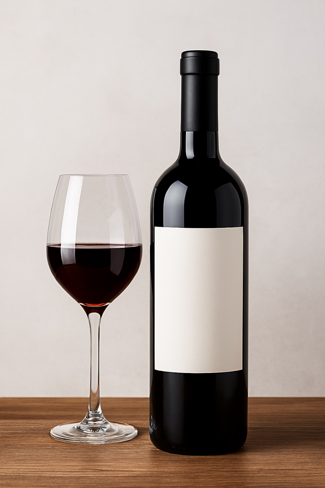
What regulation requires
Before talking about design, we have to talk about rules. An Italian wine label is subject to Regulation (EC) No. 1308/2013 and its amendments. There are mandatory statements that are non-negotiable: the designation of origin or geographical indication, the alcoholic strength, the volume, the lot number, the bottler's information, the allergens (sulfites, in this case). All of this must appear in a typeface of at least 1.2 mm — or 0.9 mm for containers under 100cl.
These elements are the skeleton. The rest — 70% of the visual surface — is the designer's territory.
The question of identity
Before thinking about colors or typefaces, there is a more fundamental question: what does this label say about whoever signs it? The Oria members who go through this process confront that question in surprising ways.
A member from Milan, an architect, designed an entirely typographic label: just his surname in a condensed sans-serif font, on kraft paper. Minimal, industrial, unmistakably milanese. Another member, from Buenos Aires, chose a watercolor illustration of the hill where his plot lies — hand-painted by his daughter. Completely different. Equally right.
The diversity of results is what makes the process exciting. When the bottles of all the Quadro members are gathered together on a table, no two are alike. Yet they all share the same wine — the same terroir, the same grapes, Roberto's hands.
The visual elements: what works
Years of observing wine labels — as a designer and as a drinker — lead to some conclusions about what makes a label memorable.
Tonal contrast: the labels that are remembered most are those with a clear contrast between background and main element. A dark background with light type. A white background with a black engraving. Contrast is not just an aesthetic matter — it is functional on a shelf where hundreds of bottles compete.
Typographic hierarchy: a good label has at most two typefaces and three sizes. The first reading — the name of the wine or producer — should be legible in one second. The second reading — designation, vintage — in five seconds. The third — all the legal information — may require the reader to lean in.
The paper: the material substrate of the label is part of the design. A textured paper communicates craftsmanship. A satin paper communicates modernity. Kraft paper communicates nature. Metallic paper communicates luxury. They all work, but none is neutral.
The part that is pure art
With everything above resolved, what remains is the element no rule can dictate: the visual soul. It is the difference between a correct label and a label that someone keeps.
The world's great wines — Pétrus, DRC, Sassicaia — have labels that are simple to the point of austerity. But each one has an internal coherence that only time and conviction can give. They are not designed in a day.
At Oria, the Quadro label design process is a dialogue between the member and our design team. It takes weeks. Print tests are made on the actual bottle, because flat paper and the curved glass surface are two completely different experiences. It is adjusted, reviewed, adjusted again.
"The best label I have ever seen in my life was handwritten in India ink. The owner's name, the vintage, and nothing else. It was perfect because it was true." — Roberto Cipresso
Art or craft. The right answer is: start with craft so there are no mistakes, and end with art so there is soul. In that order, always.
The Quadro plan includes your own label
Each year, 576 bottles with your name in UNESCO Val d'Orcia.
Talk to Giulia about Quadro